Exposing social media and the attention economy
Solution:
Vortex, an app that satirizes addictive-by-design social media.
Role:
I did everything, from initial research to prototype. It was never coded.
There are so many things wrong with social media right now. In this project, I aimed to tackle only one of its issues: the amount of time we spend every day with our screens glued to our faces, numb scrolling for hours on end.
Some may say it's a personal problem: if the time you spend online is being harmful in any way, it's because you're not being disciplined enough. It's your fault.
I disagree. Of course, discipline won't hurt, but it won't solve the problem either. It all comes down to a bigger, systemic issue. The attention economy.
The attention economy is a byproduct of social media’s current business model. In it, the company’s revenue is directly proportional to the number of ad views and engagement they can get from their users.
Everyone has the same 24 hours a day, and companies need to compete against each other to make sure that people are spending those sweet minutes on their proprietary platforms.
In order to grow, social media is addictive by design.
We start feeling that we need to use social media all the time: not because we need it, but because we have become addicts. Our impulses are prioritized over our intentions.
Users are the ones being negatively impacted by this. Push notifications, that can be received at any time, make our attention spans shorter. Infinite curated feeds make us spend our time in ways that do not contribute to our well being. Several studies link time spent online to mental health issues.
Raise public awareness about the predatory design patterns that cause addiction.
Social media users must know they are being manipulated so they can pressure companies and legislators into attention-friendly policies, just like they do with personal data.
Designers, developers, and PMs also have a huge role in this: only by taking upon principles such as the prioritization of time well spent over impulse, truly human-centered products may rise.
Companies will also have to adapt to not be seen as unethical and to retain talent.
During the research phase, I read a lot and found some interesting organizations and products around the subject, such as the Center for Humane Technology. Some are worth highlighting:
Distraction-Free Youtube and Facebook Newsfeed Eradicator are browser extensions that remove addictive components from the interface, such as the recommended videos sidebar.
Apps like Hindsight go for a different approach. They aimed to help users reflect and read data that helped them stay away from certain products or use them less.
But Binky stood out to me. It's a brilliant app by Dan Kurtz that satirizes the way we use our phones as fidgets. In it, we can get all the satisfaction we get from scrolling, liking, and commenting, but without any real-life consequences.

Binky got me thinking and didn't get me bored. Once I felt that I knew it was the exact emotion I wanted to provoke with my project.
I wanted to make it all more tangible. How exactly did addictive design materialize in terms of interface components?
I started collecting screenshots from popular apps and highlighting parts that were trying to persuade or make users act under impulse.
Some products develop components that make users stay in the flow without even thinking about it. Infinite feeds, autoplay, and notification bubbles are used to induce user behavior into what is most profitable for the company.
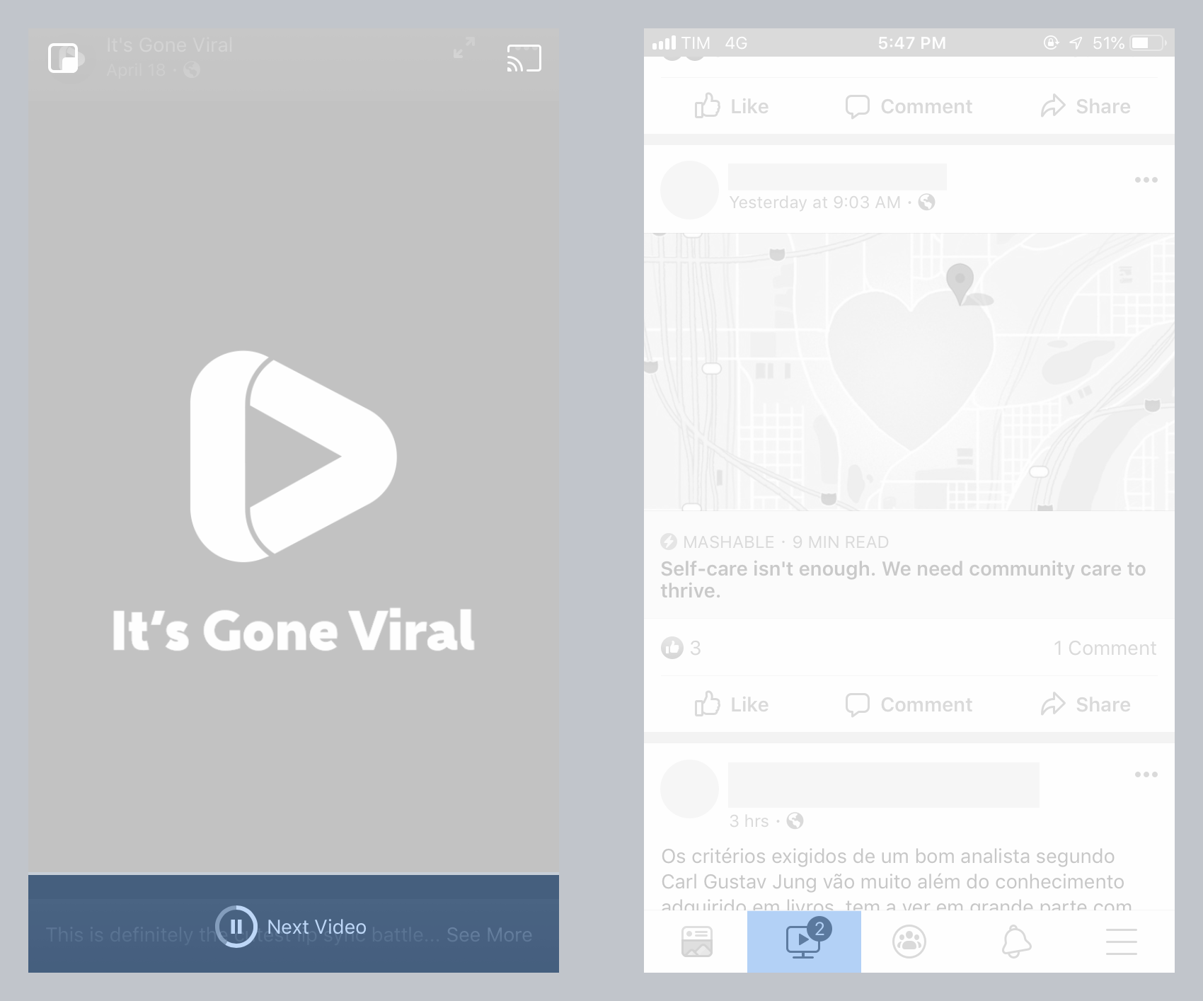
Products also use all the data they have collected about you and your friends to persuade. It’s common to see friends’ names next to sponsored content and other areas of interest for the business.
Sometimes, the copy of components aims to set a sense of immediacy into the minds of users. This way, they will comply with whatever the product says is important.

Notifications are also a huge part of digital products nowadays.
They are distractions served to you all day long, baiting you into opening the app one more time. They also make it seem like there’s always something going on, so when you’re inactive it feels like you’re missing out.
Addiction patterns are all scattered throughout the interface. All you have to do is to pay proper attention.
I found that some of the screenshots I collected were absurd to the point of being funny. But I knew I could take it a step further. That's when I started working on Vortex.
Vortex is an app that satirizes addictive-by-design social media.
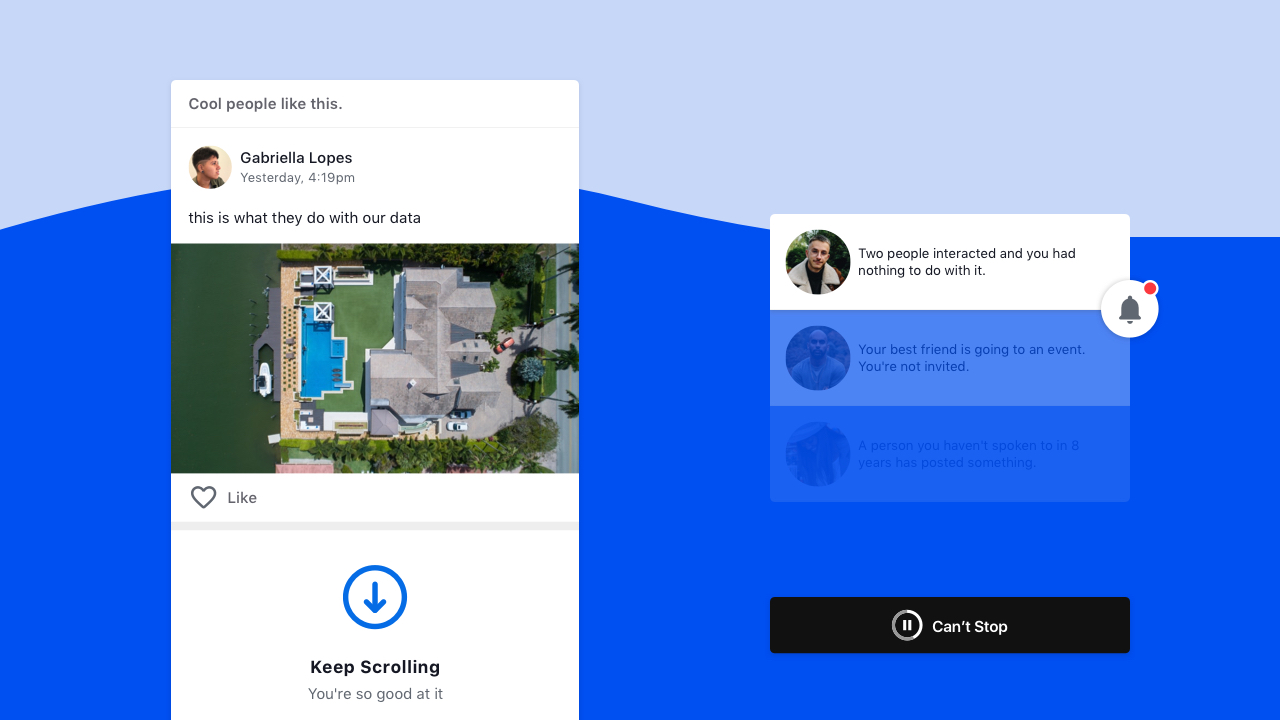
Absurdly and humorously, Vortex takes getting the users’ attention to the next level. It doesn’t care to hide any of its tricks to get you hooked, as long as it’s effective.
The familiarity with other social media platforms is meant to help people spot them easily when they show up in actual mainstream products. Hopefully, you won’t be able to just go by them without thinking twice ever again.
You can browse Vortex yourself in this prototype, but I’ll go through it in the following sections.
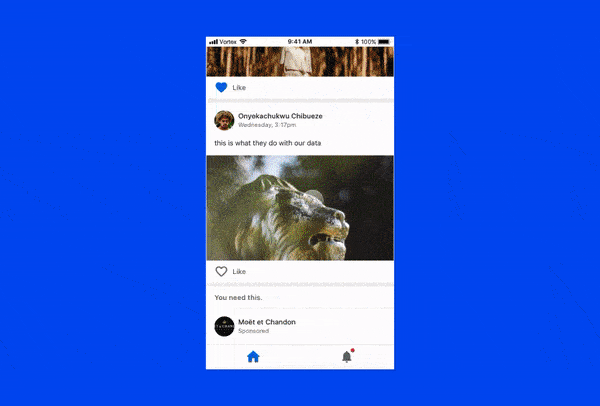
At first glance, it looks like any other feed you’re used to. But then, some things start to seem off.
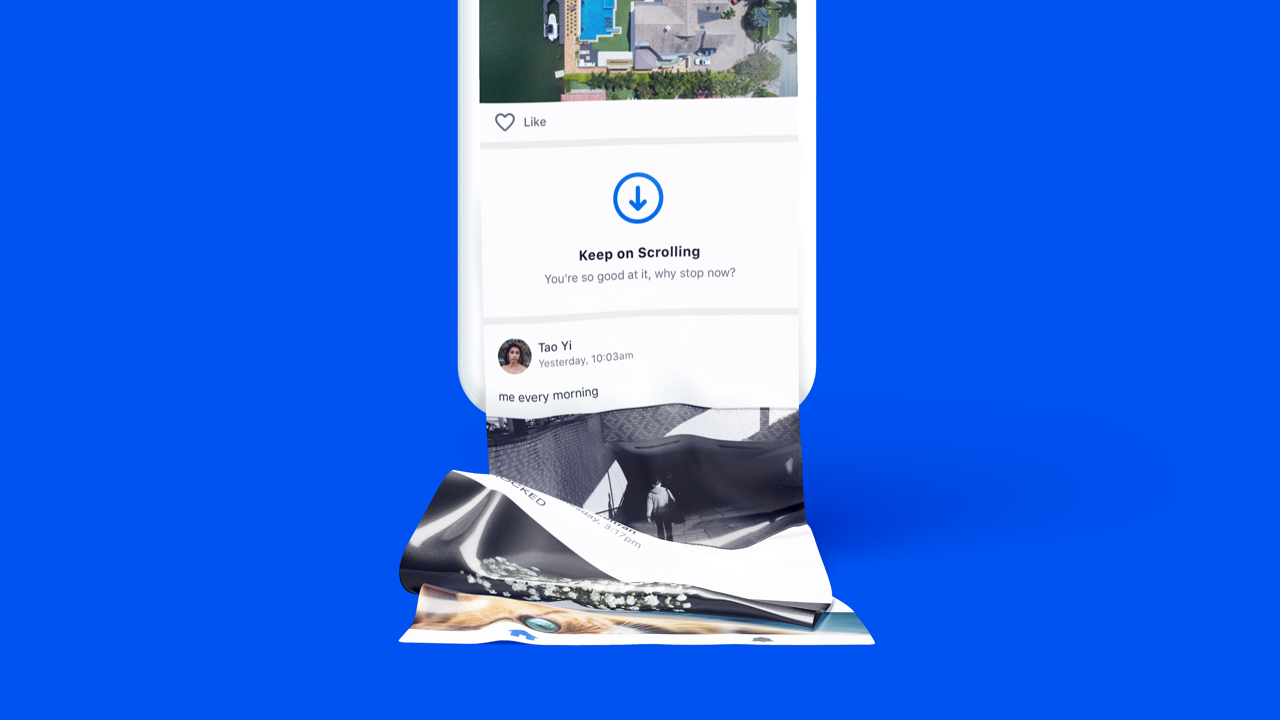
In between posts you’ll find Scroll Motivators. They use all sorts of persuasion techniques (such as scarcity, authority, reciprocity, and social proof) to accomplish their one goal: keep you scrolling.

But Vortex needs more than scrolling. It needs you to like organic posts and buy sponsored items. That’s why it uses Persuasion Headers to convince you to engage with the content.

We’re so used to autoplay features on video products that we don’t even question them anymore. Before the user even has time to think about whether or not to watch a new video, the system makes this decision for them.
But what if products automated other activities to keep users in the flow?
In Vortex, after you’ve engaged with enough posts on the feed, the system will take over and automatically like posts and buy products by itself.
Also, make sure to not get too excited about the possibility of stopping this automated madness. Tapping on pause will only cause you further frustration.

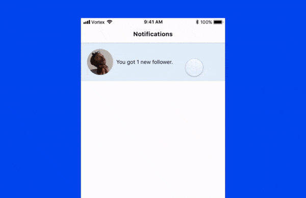
An entire tab in Vortex is dedicated to Notifications. There’s always a new one, even when nothing is going on. Taping one of the received notifications only leads to a new one popping up.
I had a lot of fun with the final result, but the making of was also really cool. Here are some things I’d like to share:
- All components on Vortex are based on an atomic Sketch Library. That made it easy to scale the feed and the notifications. I also used interactive components in Protopie.
- The copy of the posts and notifications are a bit random. I created text files with ideas for posts and notifications copy, and then I used Sketch Data to populate the symbols at random. The best part is that some of the copies are unaltered from what I found on my real feeds.
- The name Vortex came from a Nielsen Norman article. It’s all about users reporting a lack of control over time spent online.
- Some tweaks were made along the way. I got Vortex in the hands of some people to learn from their perception and spot usability issues. Some entirely new features were created because of it. To name a few: the pause interaction on Immersion, and easter eggs after the last post and notification.
- It’s a lot cooler in the prototype. I love prototyping. I tried to give you a glimpse of the Vortex experience but there’s nothing like holding it and using it yourself. The best experience is opening it in a Protopie Player app (you even get haptic feedback!), but you can also play with it in your browser.
There are some things I would like to address before ending this article. I don’t think that companies and designers behind social media are evil (ok, maybe some are). But I do think that ad-based business models have the power to corrupt.
As designers, developers, and PMs we have the moral obligation to think of the user experience not only in terms of what happens between the touch of a finger and a screen. We must also be held responsible for the impact we have on all other facets of people’s lives.
I think social media products could be much more valuable and humane centered than they are nowadays. I would love to, at some point, design for one. Hopefully, it won’t be as creepy as Vortex.