Helping developers debug Globo's video player with real-time stats
Solution:
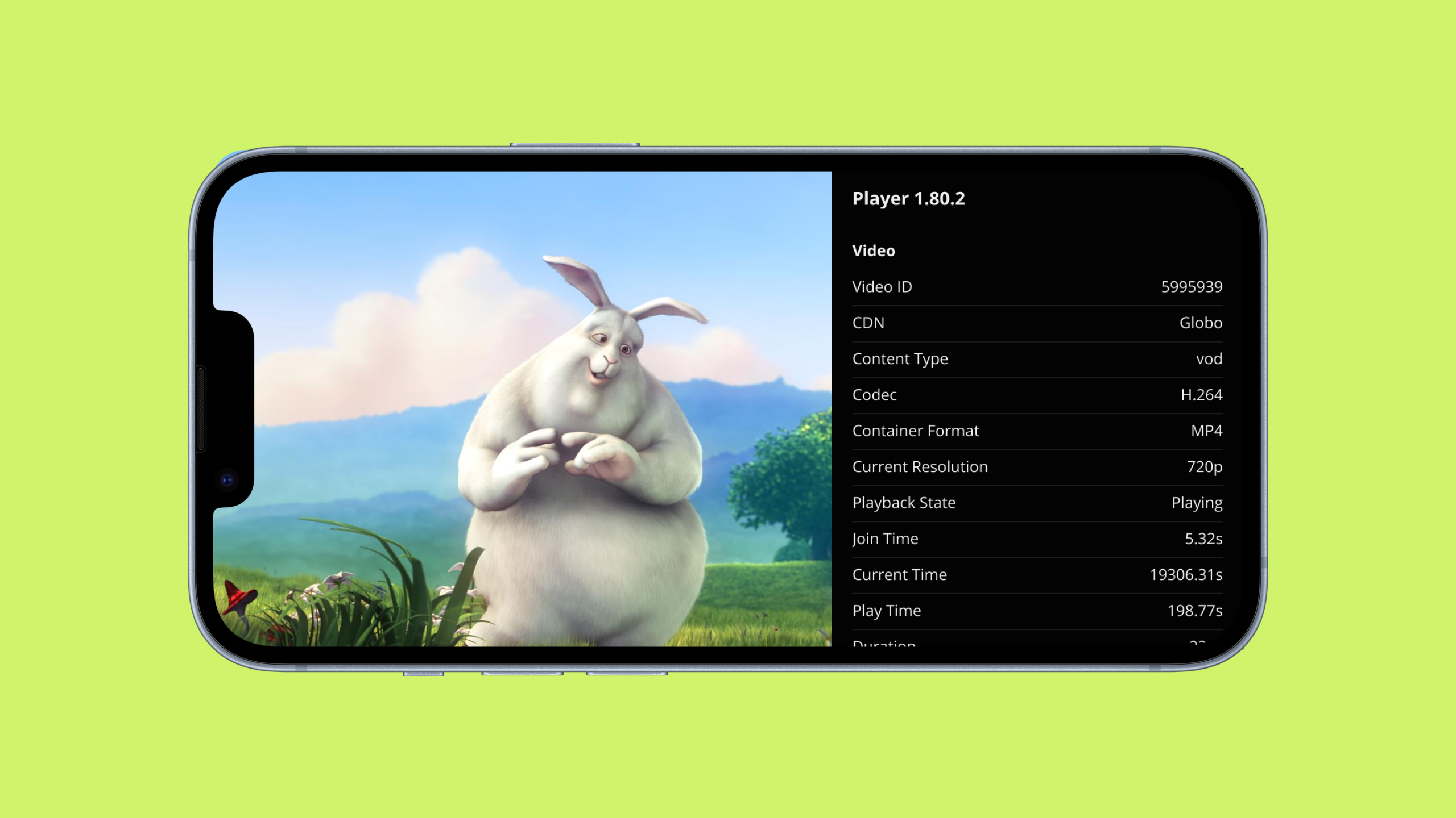
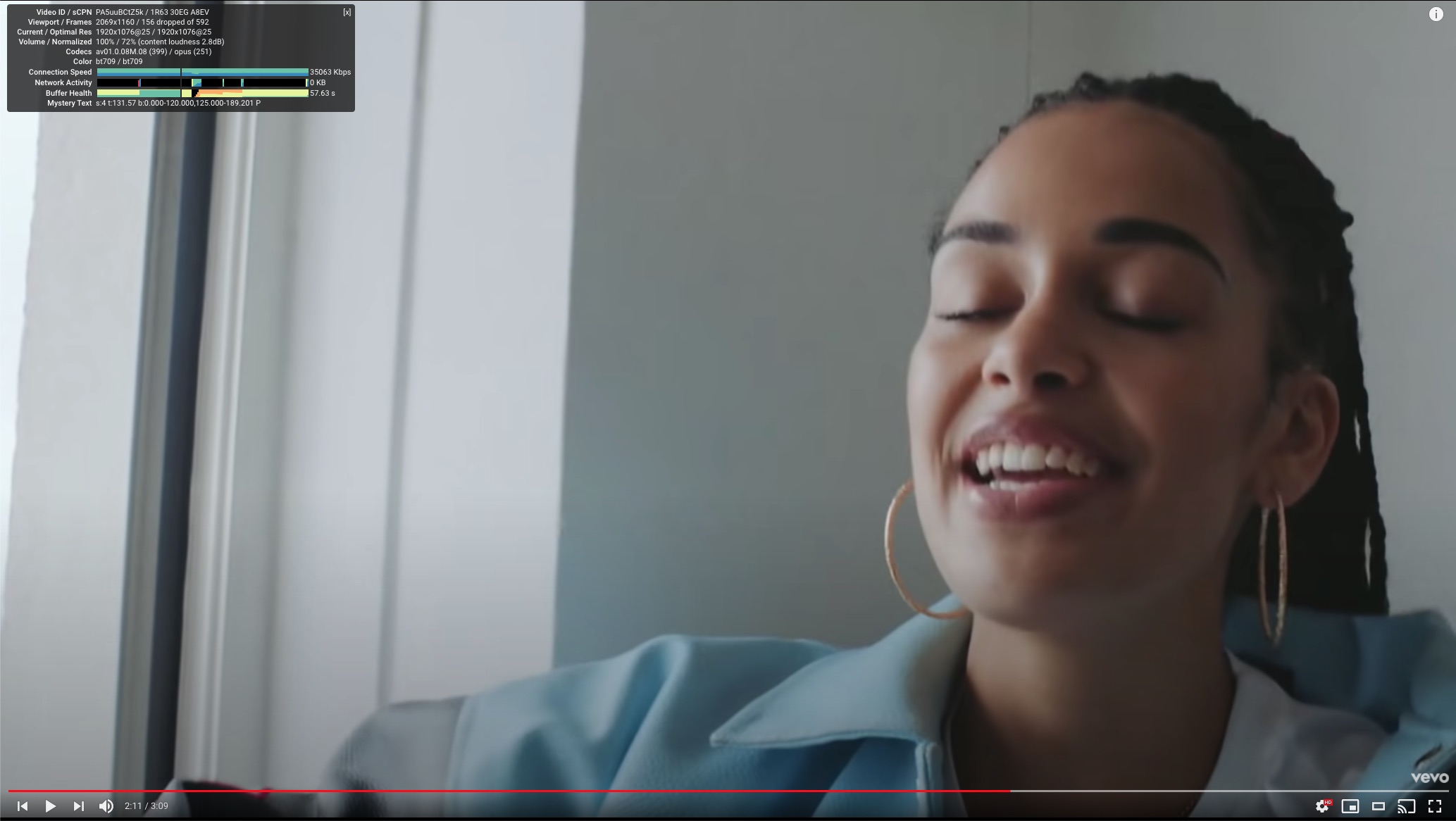
Stats, a hidden panel that displays technical playback data.
Role:
I was in a team of three designers, a PM, and many developers. We all helped each other during the entire process.
I design Globo's video player for multiple TVs, desktops, and mobile platforms. Each platform has its developing team. I was part of a pool of three designers that worked with all five developing teams.
Debugging a video player can be challenging, given the dynamic nature of content streaming. Some problems could only be reproduced in specific conditions, and for a short amount of time.
We were tasked with helping developers from all Player teams see the info they needed to successfully debug their project on the go, regardless of the device or app version they were using.
Debugging Globo's video player was more difficult on some platforms. TV developers sometimes had to directly connect their computers to the TV to get some of the information they needed to understand why a problem was happening.
It was worse if an issue was detected by a developer from another team or a non-technical personal. They were often unable to provide all the information needed to help developers further investigate the issues.
Some player developers we talked to stated that it was difficult to find some of the information they needed for debugging. Other developers reported that some of the information that was displayed wasn't useful at all.
Our goal was to provide a way for developers to easily see all debugging information they needed from players on all platforms.
We knew we weren't the first to be tasked with this challenge. So our first step was to do some benchmarking on how other video players solved it.
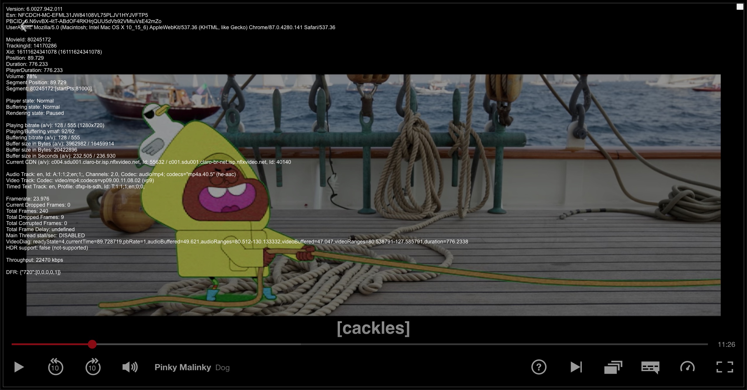
Netflix made a Stats feature available only through specific key combinations that displayed a not-so-secret overlay on top of content with all the debugging information. The menu was displayed on top of all playback controls, making them unclickable.
Youtube has the famous Stats for Nerds feature. It can be activated by anyone on all devices via a button or contextual menu. It is placed between the video and the playback controls, keeping them both visible and interactive.
The Nerd Stats panel showed graphical visualization for some properties, could be dragged around the player, and its content could be copied into the clipboard.
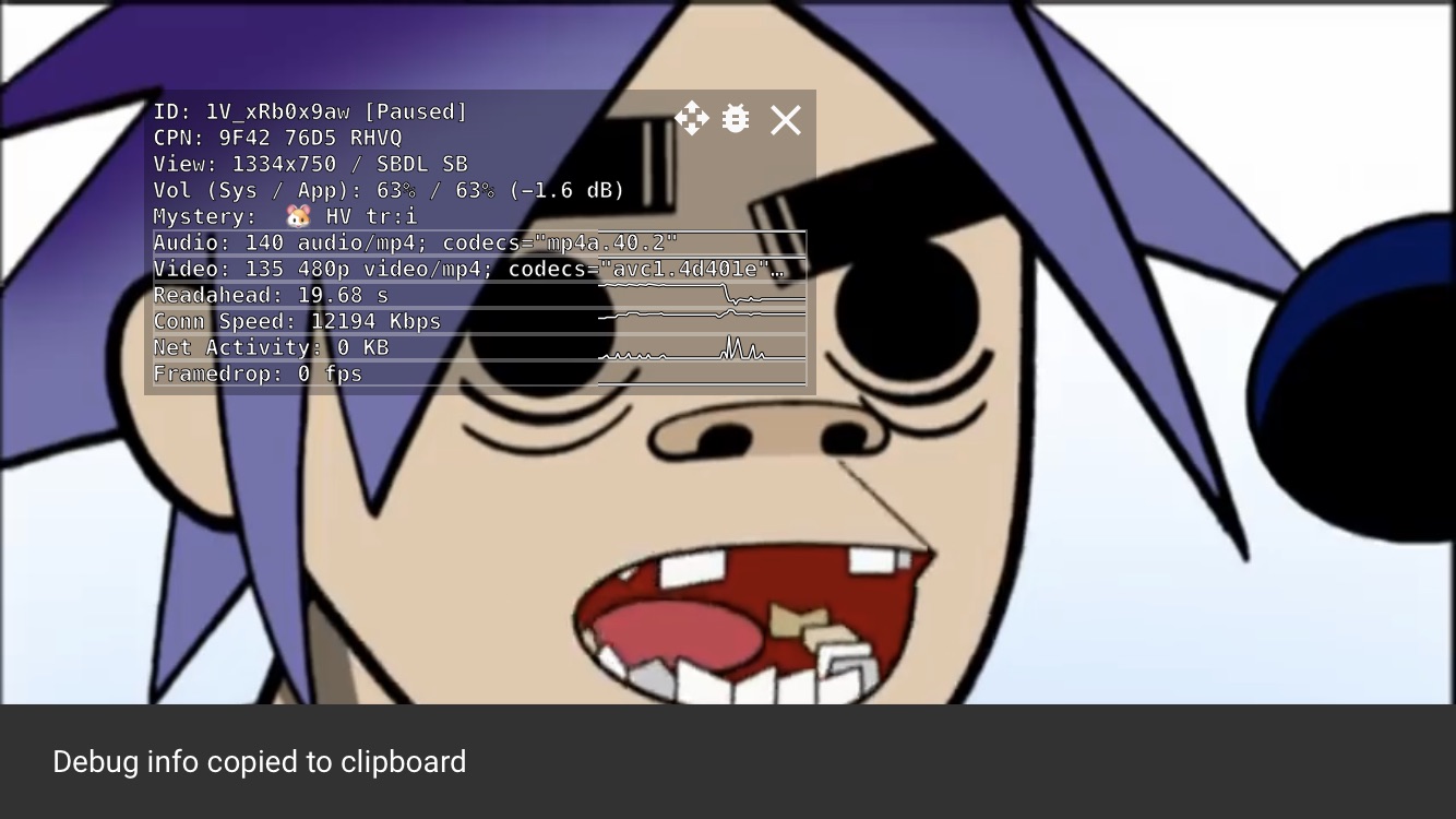
The benchmarking helped us debate some points with our developers and PMs. We decided that we didn't want to make our debugging tool available to the public (as did Youtube) and that we needed to be able to control the media as debugging happened (contrary to Netflix's solution). Our developers also said they didn't need to copy the information into the clipboard, since the information was dynamic and that they could screenshot.
It also helped us understand what debugging data had been deemed useful by other video streaming companies.
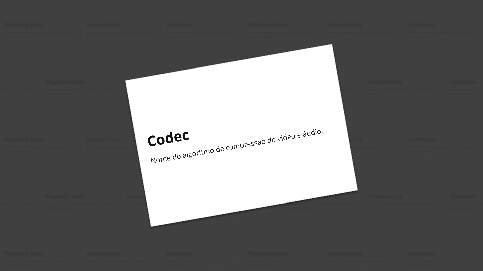
One of this project's main difficulties was designing with data we didn't understand. I had recently joined the team and had no idea what the difference between a Codec, a Container, and a CDN was.
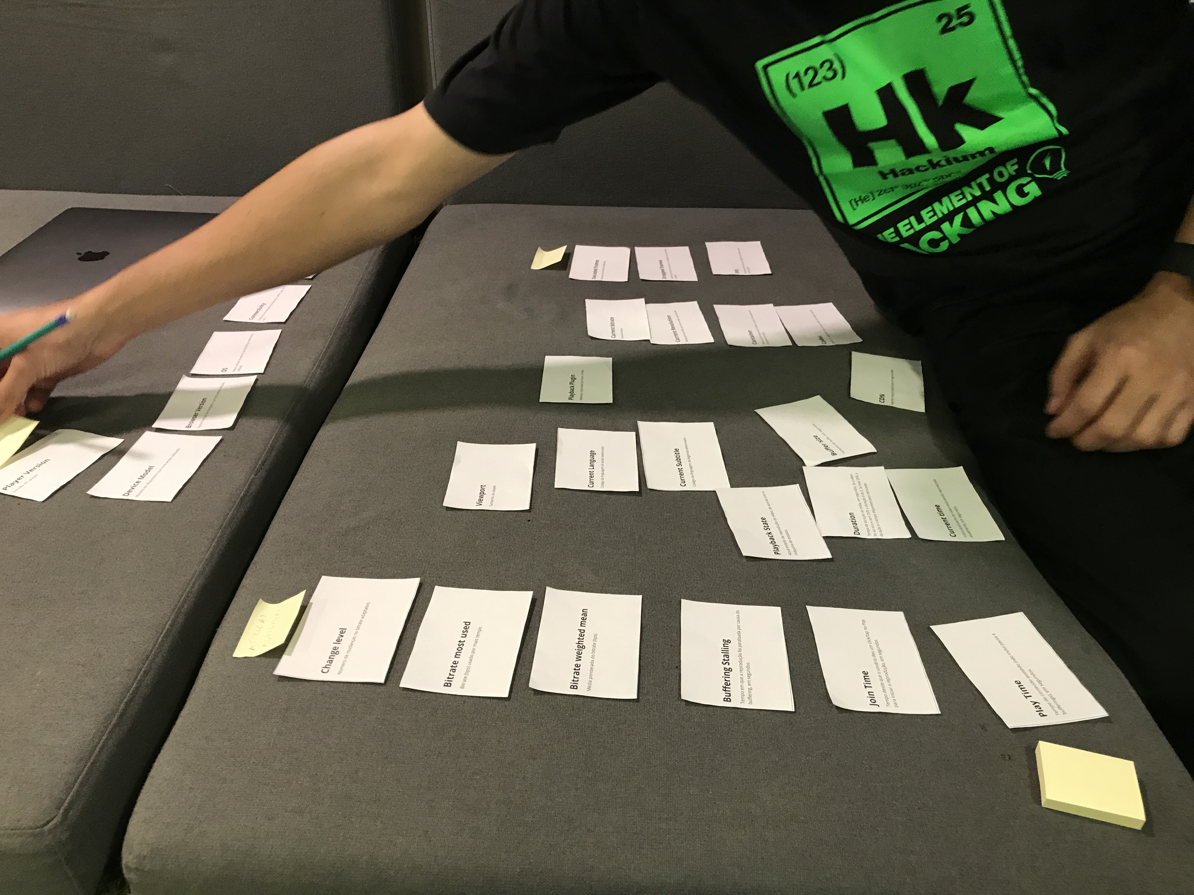
We collaborated with developers to get a list and definition of what data they thought was relevant to their debugging process. We also asked them to give us sample values for each of those fields, so we could place them on the interface later.
We documented everything in a Sheets file. The PM and all developers were invited to review the file and add anything that could be missing.
We, the video player design team, created cards for each of the data we gathered from our developers. Each card contained the name of the property and its definition.
Our goal was to align with everyone what data was needed and how we could group them. We figured that since developers would be the ones using it for debugging, they were the specialists on this task.
We did some open card sorting sessions with in-office and remote developers. We asked them to group cards and name each of the groups, explaining their mental models.
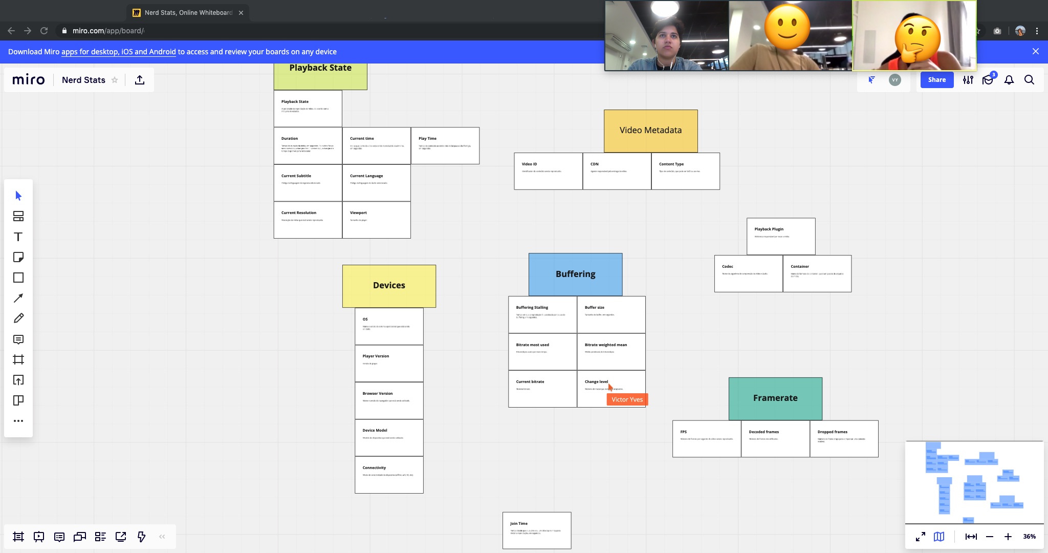
We then updated our Sheets file to accommodate the newfound categories and get approval from developers from all player teams. In the end, we settled with three data categories:
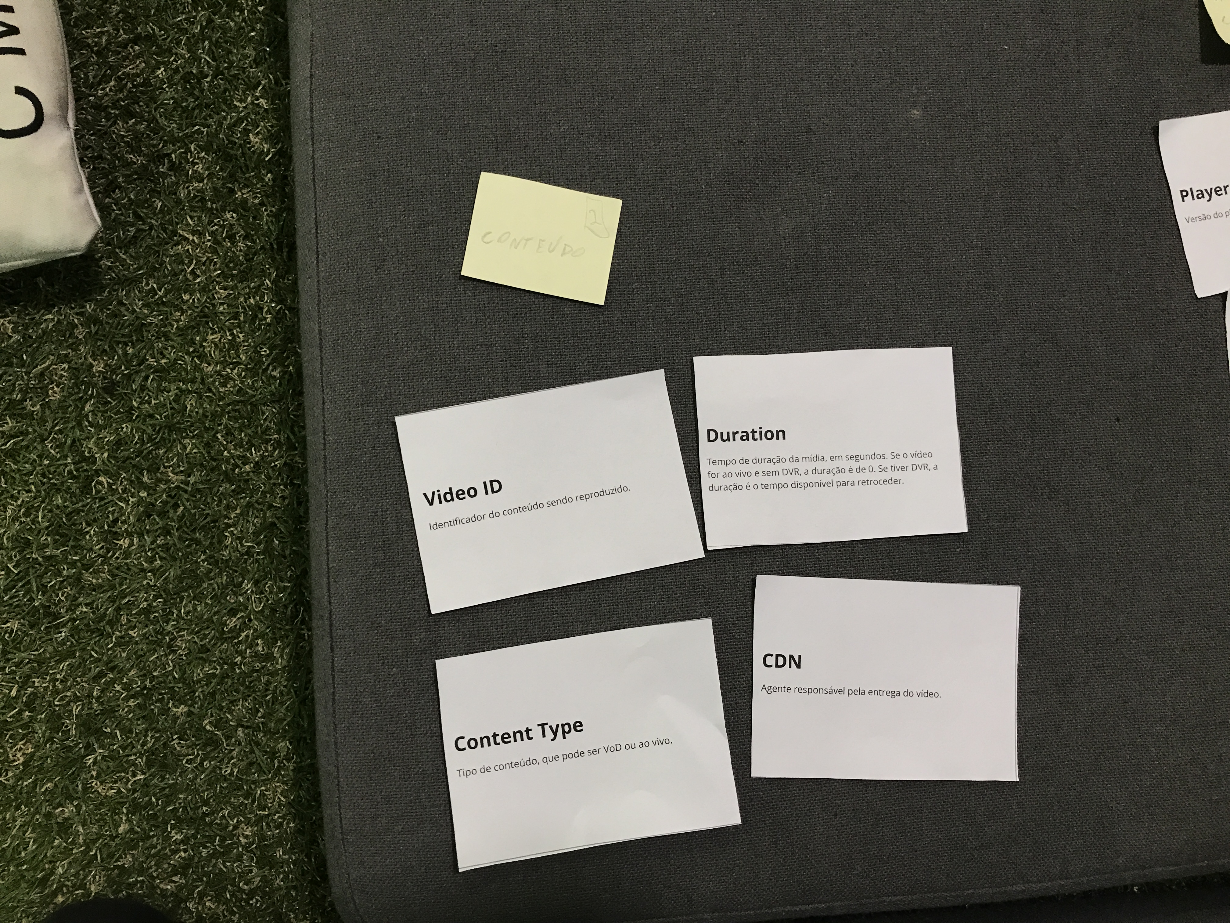
Video – Data related to the content itself and playbacks, such as the media duration and selected subtitle.
Environment – Data about the device and network conditions, such as User Agent and Connectivity Type.
Performance – Stats on the quality in which the content was streaming, such as Adaptive Bitrate and Dropped Frames.
Earlier in the benchmarking phase, we had already decided that developers should be able to use the player's controls as they read debugging stats.
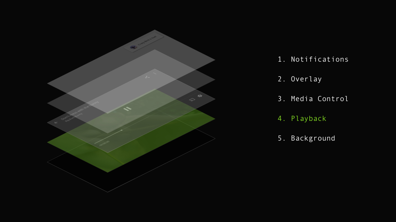
That's why we placed our Stats plugin in the Playback layer, right above the video and subtitles.
We also defined, along with the developers, what the secret combination would be to activate this data visualization in each platform. We internally documented this, so anyone could access the feature when needed, regardless of the team.
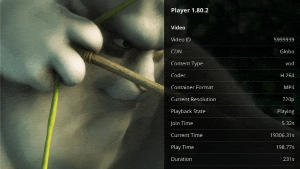
Finally, we drew and prototyped how Stats would look like in the Player.
I see a lot of room for improvement in this project.
We could have designed a way to pin properties, so only the needed data is shown. This would free a lot of screen space, especially in smaller devices. It would also be useful for developers to evaluate streaming quality by looking at the video itself.
We could also show some of the data as graphic representations of how its values have changed over time or give baseline values for each property.